
Platform Panels
This page covers every Inspector section that is a
Platform panel rather than an
Engine component — DiceyTable's own
classifications and scene-authoring concepts, rendered with the Inspector's platform
header accent. PIECE is the one Platform panel with a page of its own —
piece.md — because it sits on every object selection
alongside the engine sections; everything else Platform-owned is here.
Two different replication stories, stated once#
The object-level panels below (SOUND SETS (BUILT-IN), DIE SETTINGS, BUTTON, CONTAINER,
SOUND OVERRIDES) live on TableObjectState — mostly on its metadata, exactly like the
fields on entity.md, and in CONTAINER's case on three
first-class fields as well (container, containerMode, capacityLimit). All of it
replicates through the normal snapshot-delta system, covered field-by-field in
objectStateEq.
Everything else on this page — Room, Table, Floor/Ceiling, Wall, Poster, the folders, Room
Light and every Seat field — lives on EditSceneSnapshot (RoomModel, SceneEnvironment,
SeatZoneConfig), not on TableObjectState. That is the scene
document, authored once and read by the host
when a table session starts from the mod's saved setup. It is not part of the per-tick
TableSnapshot object replication these docs describe elsewhere, and it is not threaded
through objectStateEq. Where "Replicates" appears in a field table below without further
qualification, it means scene document only — how the host's live-session bootstrap turns
that document into what players actually see is not something this Inspector reference traces;
treat it as a separate, unconfirmed question rather than something this page answers. Seat
zones never enter the replicated snapshot at all: the older TableSnapshot.zones collection
that once shadowed them was retired, so the scene document is the only place a zone lives.
Sound Sets (Built-in)#
Admin-only, read-only. Shown on an object selection only for a standard (non-custom-model)
piece, and only to an admin account — everyone else never sees first-party clip identities at
all, per the sound-pack license.
Source: the sounds EmCollapsible (tone="platform") in TableEditModeShell.tsx's object
branch.
| Field | Type | Runtime effect | Replicates |
|---|---|---|---|
| (one row per sound event) | read-only text | Shows {event} → {action} → {builtInSetId} for each event this piece's kind can emit, resolved from the piece's current Surface. Purely informational — nothing here is editable. |
n/a — a read-only view of code-side data, not a document field |
A piece whose kind emits no sound events shows "No sounds mapped for this piece." instead.
Die Settings#
Shown on an object selection only for a basic die — a standard dice preset
(metadata.standardPresetFamily === "dice" with a standardPresetId set). Custom/imported
dice do not get this panel.
Source: the dice EmCollapsible in the shell's object branch.
| Field | Type | Range / units | Default | Runtime effect | Replicates |
|---|---|---|---|---|---|
| Background | color | hex #rrggbb |
the standard die's built-in background | Recolors this specific die's body. | Yes — metadata.diceColors.background |
| Numbers | color | hex #rrggbb |
the standard die's built-in numbers | Recolors this specific die's pip/number texture. | Yes — metadata.diceColors.numbers |
| Reset | button | — | — | Clears metadata.diceColors entirely, reverting to the built-in look. Disabled when there is no override to reset. |
Writes metadata.diceColors to absent |
Button#
Shown on an object selection whose kind is button. Every field lives in
metadata.button, so all of it replicates and persists with the object — a button needs a
dozen knobs and none of them was worth a new TableObjectState field.
Source: the button EmCollapsible in the shell's object branch.
| Field | Type | Range / units | Default | Runtime effect | Replicates |
|---|---|---|---|---|---|
| Shape | select | Rectangular / Round |
Rectangular |
Round uses one silhouette generator with the radius fixed at half the width, so Depth and Corner rounding are hidden. |
Yes — metadata.button.shape |
| Width / Diameter | number | 0.05–4 units | 0.34 | Cap footprint. Labelled Diameter for a round button. | Yes |
| Depth | number | 0.05–4 units | 0.24 | Cap footprint (rectangular only). Kept in the schema for round buttons so flipping shape never loses it. | Yes |
| Cap height | number | 0.02–1 units | 0.075 | How tall the moving cap is. | Yes |
| Travel | number | 0.005–0.5 units | 0.032 | How far the cap dips. Clamped to 80% of the cap height at render time, so a pressed cap can never invert through its own frame. | Yes |
| Corner rounding | number | 0–1 (fraction) | 0.34 | Fraction of half the smaller footprint dimension. 0 is a hard-cornered slab; 1 rounds the short axis into a semicircle at each end. A fraction rather than a length so the silhouette survives a resize. |
Yes |
| Edge fillet | number | 0–1 (fraction) | 0.45 | Fraction of the part's own height. This is what makes the plastic read as moulded — a hard 90° top edge catches a specular line no injection-moulded control has. | Yes |
| Cap / Cap pressed / Frame / Base / Text | color | hex #rrggbb |
see schema | Cap pressed is derived by darkening the cap when left unset. |
Yes — metadata.button.colors.* |
| Frame | boolean | — | on | Switches the bezel off entirely. The two numbers below stay on screen either way. | Yes — metadata.button.frame.enabled |
| Frame thickness | number | 0.005–0.5 units | 0.028 | How far the bezel extends past the cap on each side. | Yes |
| Frame height | number | 0.005–0.5 units | 0.026 | How far the bezel stands proud of the base. The bezel also climbs the cap's lower third — as a thin band between plinth and cap it was invisible from a seated camera and vanished on the slightest downward settle. | Yes |
| Face | select | None / Text / Image |
preset-dependent | Text is drawn to a canvas locally and never replicated as pixels; an image is a repo-relative path resolved through the AssetResolver. | Yes — metadata.button.face |
| Label | text | ≤64 chars | PRESS |
Text faces only. Auto-fits to the cap. | Yes |
| Image path | text | ≤400 chars | — | Image faces only. Repo-relative, e.g. assets/textures/icons/go.webp. |
Yes |
| Who can press | select | Anyone / Whoever's turn it is / The host only / Specific seats… |
Anyone |
Enforced host-side, where the press is applied — a disabled control on a peer's screen restricts nothing, because the peer still holds the code that sends the intent. Refused presses write a log line. | Yes — metadata.button.restrictTo.scope |
| Allowed seats | chips | seat ids | none | Only for Specific seats…. An empty list means nobody can press it — a valid display-only button, but rarely what was meant. |
Yes — metadata.button.restrictTo.seats |
| Pressable while editing | boolean | — | off | Off means a click in the scene editor SELECTS the button so the gizmo can move it, rather than firing it. No effect at a real table, where the simulation is running and a press is always a press. | Yes — metadata.button.editorPressable |
| Event name | text | ≤64 chars | button-press |
What a press reports to scripts. Branch on this, not on object ids — ids change on every spawn. | Yes |
Buttons are static furniture. Both presets ship
lockedandphysics.bodyType: "static", so a thrown die or a dragged card can never shove a control across the table. A press plays the dedicatedpresssound (a sharp switch click) rather than the generic plastic "place" thud — per-button clicks still come fromsoundSetOverrides.
Whoever's turn it isneeds turn mode on. With turns off nobody is the active player, so the button cannot be pressed at all. A null active seat deliberately does not read as "matches everyone" — that would turn the strictest setting into the loosest exactly when turns are disabled.
Container#
Shown on an object selection whose kind is bag. Everything an author sees calls it a
Container — bag is a wire value and is never displayed. The kind stayed bag because
roughly fifteen deck || bag tests have to keep agreeing (the redaction gate, the shared
action gate, getContainerContentsFromObject, the table-script BagObject handle, the mod
DTS, the TTS import mapping), and a miss in the redaction gate is a hidden-information leak
rather than a cosmetic bug. tableObjectKindLabel is the one place that translation happens —
the same treatment component-pack gets.
Source: the container EmCollapsible (tone="platform") in TableEditModeShell.tsx's
object branch, which renders ContainerPanel.tsx — and, for the contents block,
ContainerContentsEditor.tsx.
The two Search rows live here rather than on PIECE: they are container policy, and PIECE now keeps that pair for decks only.
| Field | Type | Range / units | Default | Runtime effect | Replicates |
|---|---|---|---|---|---|
| Form | select | Holder — open, pieces stay physical / Bag — closed, pieces are absorbed |
Bag |
A holder is open scenery: pieces fall in and sit there under physics as ordinary loose bodies anyone can pick back out, and it stores no contents at all. A bag is closed: a piece dropped on it stops being a body and is appended to the bag's contents, and drawing spawns it back. Switching to Holder drops contents, because containerStateSchema refuses a holder that claims to have any. |
Yes — container.form |
| Container mode | select | Random / Stack (last in, first out) / Queue (first in, first out) |
Random |
Which piece a draw takes. Disabled unless this is a finite bag — a holder's pieces are loose bodies picked up by hand, and an infinite container always dispenses the same source piece, so draw order is meaningless for both. Random picks a piece uniformly, not a row: 199 black stones and one white one draw white one time in two hundred. |
Yes — TableObjectState.containerMode, a first-class field |
| Capacity | number | 0–1000, integer | 0 — unlimited |
How many pieces the container will hold. A full container refuses further drops and the piece returns to where it was picked up. Disabled while Infinite is on. | Yes — TableObjectState.capacityLimit. Unlimited is the absence of the key: the field is z.number().int().min(1).max(1000), so entering 0 clears it rather than storing a zero. |
| Infinite | boolean | — | off | Never depletes. A draw spawns a copy of one authored Source piece; a matching piece dropped back in is destroyed, and a non-matching one is returned to the table rather than silently converted. Turning it on drops contents; turning it off drops source. Both are superRefine refusals, not preferences. |
Yes — container.infinite, container.source |
| Secret contents | boolean | — | off, and the default is load-bearing | On, the contents become hidden information — at the cost described below. Off, they ride the wire in clear and the UI simply does not show them. Disabled on a holder, which has no stored contents to hide. | Yes — container.secretContents |
| Search | select | Not set / No one / Owner seat only / Host only / Owner seat and host / Anyone |
Not set |
Who may privately look through this container. Set here, it overrides the surrounding Area zone. Not set removes the key, which is the only way back to unauthored: the container then inherits from its zone, and then from the kind default. |
Yes — metadata.search.audience |
| After search | select | Not set / Shuffle the rest / Keep the order |
Not set (→ Shuffle the rest) |
What happens to the remainder when the searcher closes it. Resolves independently of the audience, so a container that sets only this still inherits the zone's audience. | Yes — metadata.search.onClose |
A container's kind default is
No one. Unlike a deck (Owner seat and host), a container draws at random by design — that randomness is the mechanism — so browsing one and pulling out the piece you wanted is against its nature. TheNot set (…)label names the kind default, not the zone's value. Full precedence rules: Deck and Bag Search.
Settings authored before the container field existed (metadata.infinite,
metadata.containerMode, metadata.containerCapacity) are still read — by
resolveContainerConfig, and nothing else — so an old bag opens here showing what it actually
does.
What Secret contents costs#
Turning it on puts the whole table on broadcastRedactedFull — per-peer full
snapshots, with delta compression disabled — for as long as that bag is non-empty. That is the
same cliff a deck of face-down cards already carries, and it is a table-wide cost, not a
per-object one: expect the host's uplink and main-thread serialisation to limit the room to a
handful of remote players. The panel states this next to the switch, because an author cannot
weigh it against "I would like this hidden" unless the switch says so.
Leave it off and the cost is nothing. A piece bag's contents are unseen, not secret — everyone watched each piece go in, and authored starting contents sit in the mod's public GitHub repo anyway. The thing that must stay secret, which piece the next draw yields, is decided by the host's private RNG at draw time either way, and is not derivable from the contents.
What is in it — one question, three answers#
The contents block sits below Form and Infinite on purpose: those two decide which of three answers it can give, because the three container shapes keep their pieces in three different places.
| Shape | Where the pieces actually live | What the panel shows |
|---|---|---|
| Infinite (either form) | container.source — one definition |
a single Source piece slot |
| Finite bag | container.contents — run-length-encoded runs |
a Contents rows list with counts |
| Finite holder | real objects standing in the bowl | a Fill action that spawns them |
Infinite — Source piece. Pick the one piece this container dispenses; every draw spawns a copy of it. Leave the slot empty and the container adopts the first piece dropped into it, which is how Tabletop Simulator does it.
Finite bag — Contents. One row per distinct piece, with a count and ↑/↓ buttons. Row
order is draw order for Stack and Queue; a Random bag ignores it entirely. Stage a
piece in the picker, set Count, then Add to contents — a piece matching an existing row
adds to that row rather than making a new one.
Finite holder — Fill. A holder has no contents list to write, so this creates real
objects. containerStateSchema refuses a holder with contents, because what is "in" an
open bowl is ordinary pieces standing in it that anyone can pick back out, and storing them as
data would be a lie about what they are. Filling a bowl with 180 go stones therefore means 180
objects — the panel just saves you placing them by hand. Each one carries a
metadata.filledFrom marker naming this container, which is how Clear filled pieces finds
them again without the container holding a list of ids that would go stale the moment a player
lifted one out. A filled piece is an ordinary piece: delete it from the Hierarchy and it is
gone from the table like any other.
A Fill needs a resolvable cavity — the model's
containerInterior volume, authored in the
Model tab's CONTAINER INTERIOR panel, or
derived from the collider bounds when none is authored. With no cavity at all nothing is placed and the panel says so. A short fill is
reported rather than rounded off in silence: "Placed 40 of 180 — the cavity filled up."
Where a piece comes from. Either the standard-preset list in the picker, or a project
.glb/.gltf dragged out of the asset Explorer onto the slot. The list is filtered, not just
listed: card and deck presets are absent because a container holds either cards or pieces
(the one-lane rule the table enforces on the drop), and bag is absent because
containerItemDefinitionSchema omits container, so containers structurally do not nest.
A stored item is a spawn definition minus everything positional — no id, position,
ownerSeat, parentId or diceTray — and minus secretMetadata, the one field redaction
strips per viewer.
Two pieces that differ only in colour are different pieces#
Rows are keyed by containerItemIdentityKey, built from what a player can see and what a
draw would reproduce: kind, the model reference (and, for a die, its printed face table),
colour, per-slot materials, metadata.materialId, and scale rounded to 1e-4. Deliberately not
in it: label, displayName, transform, faceDown, locked, ownerSeat and tags — two
pieces differing only in those are the same piece to a player, and folding them together is
what keeps a bowl of 200 go stones at one row.
So adding a blue cube to a bowl of red cubes makes a second row rather than merging, and at the table a blue cube dropped into an infinite bowl of red ones is returned to the table rather than absorbed. The rule errs toward never destroying a piece that differs from what would come back out: accepting it would mean silently recolouring it.
The ceilings an author can hit#
Every refusal names its ceiling and its number, in the panel.
| Limit | Value | Where it comes from |
|---|---|---|
| Distinct rows | 256 | MAX_CONTAINER_RUNS — combine rows, or use a second container. |
| Copies in one row | 10,000 | MAX_CONTAINER_RUN_COUNT. |
Serialised container field |
48 KiB | MAX_CONTAINER_STATE_BYTES — roughly 250 distinct authored piece definitions. Run-length encoding means 200 identical stones are one entry of a few hundred bytes. |
| Pieces per Fill | 500 | The holder's Fill count, mirroring the runtime's MAX_AUTHORED_CONTAINER_FILL. Repeat the Fill for more. |
A Capacity you have set is a ceiling on the rows list too. The holder's Fill is not bounded by it — the cavity is what stops that one.
Sound Overrides#
Shown on an object selection whenever its kind can emit at least one sound event
(soundEventBindingsForKind(object.kind) is non-empty) — this is every author-editable
piece with sound behavior, not an admin-only readout like the panel above.
Source: ObjectSoundOverrides / SoundActionRow, rendered inside the object-sounds
EmCollapsible.
| Field | Type | Values | Default | Runtime effect | Replicates |
|---|---|---|---|---|---|
| {event action}, one row per action | select + upload | Default (built-in), one Surface: {material} option per sound material, and one Mod: {name} option per sound this mod has uploaded |
Default (built-in) |
Overrides which clip plays for this one action on this one object. Default restores the built-in clip; a Surface: choice plays a generic material sound instead of the piece's first-party clip; a Mod: choice plays a sound you uploaded into this mod. The row's Upload… button accepts .mp3/.ogg/.wav and adds the file to the mod's own assets before selecting it. |
Yes — TableObjectState.soundSetOverrides, one entry per action |
Per the spatial sound design: each peer resolves the clip locally from the object it is looking at, so this override never leaks a first-party clip identity over the wire — only the generic material or your own uploaded clip name does.
Game#
The Game row's panel: settings about the game as a whole, with no place in the scene. Source:
the game branch in TableEditModeShell.tsx. Dice is edited by GameDiceSettings.tsx,
and its rules live in gameDiceManifest.ts.
In the Game Editor the panel also shows Debug Visibility,
Game Settings and Scene Scripts. These are the same controls
that plain /editor shows on its Room row, and they write the same fields. Plain
/editor shows only Dice here, so no setting has two places to edit it.
Dice#
Whether this game rolls dice, and which dice the table's picker offers. It writes the manifest,
not the scene: diceEnabled and
dice. A project that is not a game-pack gets a note
instead of the controls, because the scanner refuses both fields on the other pack types.
| Field | Type | Default | Runtime effect | Stored in |
|---|---|---|---|---|
| Header checkbox | boolean | on | Off hides the table's Dice toolbar menu and the VR fist dice panel. The host also refuses every dice-roll, so a stale client or a script cannot roll anyway. Turning it back on keeps the dice you chose. |
Manifest — diceEnabled: false when off. When on, the key is removed rather than written as true. |
| Dice offered | select | Standard set (d4–d20) | Standard set removes dice, so the picker offers the six ordinary dice. Choose dice starts from exactly those six, so switching changes nothing until you edit a row. |
Manifest — dice |
| Per-die row | checkbox · name · count | — | Only shown for Choose dice. The checkbox offers or drops the die. The name replaces the die's own in the picker; leave it blank to keep the preset's name. The count (0–40) is how many the picker starts at. The last ticked die cannot be unticked. An empty list means the standard set, so the picker would silently grow. To offer no dice, turn the header checkbox off instead. | Manifest — dice[].preset / label / defaultCount |
The line at the bottom (Picker shows: …) runs the table's own resolver, so it is exactly what players will see.
Room#
The Room folder's own fields, plus two sub-sections. In the Game Editor, clicking Room opens
the assign inspector instead, and these sub-sections move to the Game panel. Source: the room branch in
TableEditModeShell.tsx, immediately followed by RoomSettingsControls.
| Field | Type | Range / units | Default | Runtime effect | Replicates |
|---|---|---|---|---|---|
| Ambient | color | hex #rrggbb |
scene default | Scene-wide constant ambient light color. Ignored while a Skybox is set — a sky supplies its own directional ambient, and the engine prefers it. | Scene document — sceneDraft.environment.ambientColor |
| Fog | boolean | — | false |
Enables exponential-squared distance fog. With no Skybox set, the background is also repainted in the fog color, so fog reads as fog rather than as darkness. | Scene document — environment.fogEnabled |
| Fog color | color | hex #rrggbb |
scene default | Fog tint, and the background color while fog is on and no Skybox is set. | Scene document — environment.fogColor |
| Fog density | number | ≥ 0, clamped to 1 | scene default | Fog thickness per foot of distance. The world unit is a foot and the far wall is about 9 ft from the table centre, so density 1 is already a solid wall of fog; higher values are clamped. Density 0 counts as fog off. |
Scene document — environment.fogDensity |
| Skybox | texture slot | an equirectangular (2:1 panorama) project or built-in texture, or a Radiance .hdr sky (import .hdr/.exr through Upload — it is capped at 10 MB and downscaled to fit; see Assets § HDR skies) |
none | Draws the image as the scene background and lights the room from it. An .hdr keeps the sun's real brightness, so the lighting it produces is far richer than an 8-bit image's. The two are inseparable: the visible sky and the room's ambient/reflection environment are generated from the same pixels in one step, so a sky can never be a backdrop that leaves the lighting untouched. Clearing it restores the built-in background and the Ambient color. |
Scene document — environment.skyboxAssetId |
Debug Visibility#
Off by default (roomDebugVisibilitySchema, all fields false). Purely an authoring aid —
toggles the runtime's own debug overlays for the current Edit Mode session, drawn over the
stage.
| Field | Type | Default | Runtime effect | Replicates |
|---|---|---|---|---|
| Rigid Bodies | boolean | false |
Draws a wireframe over every rigidbody's collision shape. | Scene document — roomSettings.debugVisibility.rigidBodies |
| Triggers | boolean | false |
Draws trigger-volume wireframes. | Scene document — roomSettings.debugVisibility.triggers |
| Player Zones | boolean | false |
Draws seat-zone box wireframes. | Scene document — roomSettings.debugVisibility.playerZones |
Game Settings#
Player-count constraints for the session — the schema does not itself enforce max ≥ min; the
Inspector clamps it for you as you type.
| Field | Type | Range / units | Default | Runtime effect | Replicates |
|---|---|---|---|---|---|
| Min Players | number | ≥ 1, integer | 1 |
The session's minimum supported player count. Raising it above the current Max also raises Max to match. | Scene document — roomSettings.game.minPlayers |
| Max Players | number | ≥ Min Players, integer | 8 |
The session's maximum supported player count. | Scene document — roomSettings.game.maxPlayers |
| Supported Player Counts | comma-separated text | positive integers | `` (empty) | An optional exact-count whitelist — e.g. 2, 3, 4 means only those counts are valid, not every count from Min to Max. Blank allows any count in the Min–Max range. Parsed on blur/Enter into a sorted, de-duplicated set. |
Scene document — roomSettings.game.supportedPlayerCounts |
Scene Scripts#
Attaches one or more Table Scripts to the
scene as a whole — distinct from SCRIPT, which attaches one
script to a single object. A scene script runs with world/globalEvents but has no
refObject.
| Field | Type | Runtime effect | Replicates |
|---|---|---|---|
| Attached-script list | list, one row per attachment | Each row shows the script's name with Edit (opens it in Monaco) and × (detaches it). | Scene document — sceneDraft.sceneScriptIds |
| Add script | select, shown only when unattached scripts exist | Attaches the chosen project script to the scene. | Scene document — appends to sceneScriptIds |
| + New Script | button | Creates a new project script and attaches it to the scene in one action. | Scene document — creates a script asset and appends to sceneScriptIds |
Table#
The table surface only — no Material slot, unlike Floor/Ceiling and Wall below (there is no
materialId field on the table surface schema).
| Field | Type | Range / units | Default | Runtime effect | Replicates |
|---|---|---|---|---|---|
| Surface color | color | hex #rrggbb |
scene default | The table's base tint. | Scene document — environment.tableSurfaceColor |
| Surface texture | texture slot | any project or built-in texture | none | The table's surface image. | Scene document — environment.tableSurfaceTextureAssetId |
Floor / Ceiling (Surface)#
Selecting Floor or Ceiling in the Hierarchy renders identical fields against whichever
surface you picked (room.floor or room.ceiling).
| Field | Type | Range / units | Default | Runtime effect | Replicates |
|---|---|---|---|---|---|
| Color | color | hex #rrggbb |
#9a9a9a |
Base tint. | Scene document — room.{floor|ceiling}.color |
| Texture | texture slot | any project or built-in texture | none | Surface image. | Scene document — room.{floor|ceiling}.textureAssetId |
| Tiling | number | 0.1–16, step 0.1 | scene default | Texture repeat count across the surface. | Scene document — room.{floor|ceiling}.textureTiling |
| Material | material slot | any project or built-in material | none | Full material assignment, layered over Color/Texture/Tiling when set. | Scene document — room.{floor|ceiling}.materialId |
Wall#
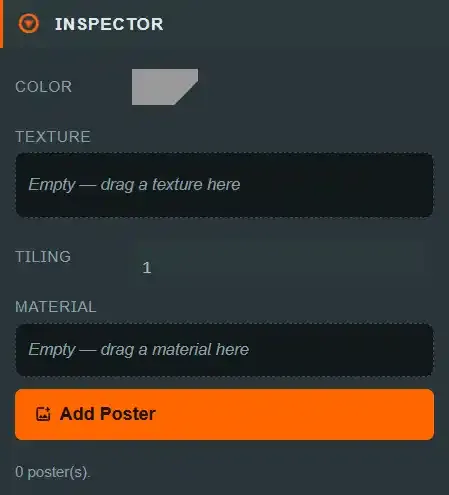
The room has exactly 4 walls, fixed — see Walls Folder below; walls are not individually added or removed. Selecting one shows the same Color/Texture/Tiling/Material fields as Floor/Ceiling, plus poster management.
| Field | Type | Range / units | Default | Runtime effect | Replicates |
|---|---|---|---|---|---|
| Color | color | hex #rrggbb |
#9a9a9a |
Base tint. | Scene document — wall.material.color |
| Texture | texture slot | any project or built-in texture | none | Surface image. | Scene document — wall.material.textureAssetId |
| Tiling | number | 0.1–16, step 0.1 | scene default | Texture repeat count. | Scene document — wall.material.textureTiling |
| Material | material slot | any project or built-in material | none | Full material assignment. | Scene document — wall.material.materialId |
| Add Poster | button | — | — | Adds a new poster to this wall (see Poster). | Scene document — appends to wall.posters |
Poster#
An image mounted on a wall, positioned in the wall's own UV space.
Drag it in the viewport to hang it. Press on the poster and drag: it follows the cursor
across any wall you can see, including from one wall to another, and Horizontal (U) /
Vertical (V) update when you release. Esc during a drag puts it back where it was, and a
click that does not move is just a selection — it never rewrites the coordinates.
Three things worth knowing about where it lands:
- Near a corner it stops with its edge flush rather than hanging off the end.
U/Vare normalised so±1is the furthest the poster's centre can go while the whole poster is still on the wall, so a wide poster's centre cannot reach the wall's edge. - A wall you cannot see is not a drop target. The Room Editor hides the wall the camera has moved behind, and its face points away from you, so art dropped there would be invisible and backwards. If the cursor is over no eligible wall the poster simply stays where it last was.
- The numeric fields still work and are the way to set an exact coordinate.
| Field | Type | Range / units | Default | Runtime effect | Replicates |
|---|---|---|---|---|---|
| Label | text | free-form | `` (empty) | Display name only — not shown on the table surface itself. | Scene document — poster.label |
| Image | texture slot | any project or built-in texture | none | The mounted image. | Scene document — poster.imageAssetId |
| Horizontal (U) | number | −1 to 1, step 0.05 | 0 |
Horizontal position on the wall. | Scene document — poster.u |
| Vertical (V) | number | −1 to 1, step 0.05 | 0 |
Vertical position on the wall. | Scene document — poster.v |
| Width | number | 0.1–8, step 0.1 | scene default | Poster width, world units (feet). | Scene document — poster.width |
| Height | number | 0.1–6, step 0.1 | scene default | Poster height, world units (feet). | Scene document — poster.height |
| Rotation (deg) | number | unbounded, step 1 | 0 |
In-plane rotation. | Scene document — poster.rotation |
| Delete Poster | button | — | — | Removes this poster from its wall. | Scene document — removes from wall.posters |
Walls Folder#
Read-only informational text: "4 walls." No add/remove controls — the room's wall count is fixed; select an individual wall to edit it.
Lights Folder#
| Field | Type | Runtime effect | Replicates |
|---|---|---|---|
| Add Light | button | Creates a new Room Light with default settings (see Room Light). | Scene document — appends to room.lights |
Below the button, a read-only count: "{N} light(s)."
In the Room Editor this folder also carries the room performance budget — a live readout of
what the room costs, measured with the same rule that decides whether a publish is refused, so
a refusal is never the first time you see the number. The row that can actually refuse is
shadow views, not light count: a 24-light room with shadows off costs no measurable frame
time, while a single shadow-casting point light re-renders everything that casts six times
(once per cube-map face). A Spot light costs one view for the same effect, which is usually
the cheaper way to get the look.
Room Light#
⚠ Not the same schema as the object LIGHT engine component
— see that page's callout. A Room Light lights the whole scene; its Type options are
labeled Point/Spot/Directional (value point, not omni — a different enum from the
object component's Type, because it is a different schema entirely).
| Field | Type | Range / units | Default | Runtime effect | Replicates |
|---|---|---|---|---|---|
| Label | text | free-form | e.g. Key Light |
Display name in the Hierarchy. | Scene document — light.label |
| Type | select | Point, Spot, Directional |
point |
Same physical meaning as the object LIGHT component's Type, under different option labels. |
Scene document — light.type |
| Color | color | hex #rrggbb |
per-light | Light color. | Scene document — light.color |
| Intensity | number | 0–8, step 0.1 | per-light | Brightness multiplier. | Scene document — light.intensity |
| Rotation (Spot/Directional) | vector3 | degrees | {0, 0, 0} |
Which way the light points. Unrotated, it shines straight down. A point light has no direction, so the field is hidden for one. | Scene document — light.rotation |
| Position | vector3 | world units (feet) | per-light | World-space location, and where the light's bulb marker is drawn. Shown for a directional light too: its shading does not depend on position, but the marker you can see, click and drag with the move gizmo does. A room light may sit outside the room box — a sun does. | Scene document — light.position |
| Range (Point/Spot only) | number | 0.1–60, step 0.1 | per-light | Falloff distance, world units (feet). | Scene document — light.range |
| Delete Light | button | — | — | Removes this light from the room. | Scene document — removes from room.lights |
The shared block: falloff, cone, lightmap, shadows and layers#
Everything below Range — Falloff mode, the Inner/Outer cone angles, the whole
Lightmap and Shadows blocks, and Layers — is the same block the object
LIGHT component carries, rendered from the same field
descriptors and applied by the same runtime function. Rather than restate ~20 rows here,
read them on that page: Basics,
Lightmap, Shadows
and Layers. A field added there appears in both panels.
Rows in this panel follow the same shape as the object component's: label left, control right, and a field's documentation in the hover card on its label rather than printed under the control.
The two schemas still differ where they always did — a Room Light has a Label, a Position,
a Follow sky lock and the point spelling of its type; an object light has none of those
and rides its entity's transform instead.
⚠ Cascades cost shadow views. The folder's budget readout counts views, not lights, and a directional light renders one view per cascade. Raising Cascades to 4 on a shadow-casting sun quadruples the row that can actually refuse a publish.
Decor Folder#
Static scenery the room places — pillars, furniture, plants. Room Editor only.
A room pack contributes no physics and no scripts, and that is enforced by the schema
rather than by convention: a decor placement's body is always static, and a room pack that
asks for a dynamic one fails to load with a named error instead of being quietly downgraded.
| Field | Type | Runtime effect | Replicates |
|---|---|---|---|
| Add from model | select | Places the chosen project model at the centre of the floor. Drag it from there. | Room pack — appends to roomPack.decor |
Below it, a count: "{N} of 128 placement(s)." The list is empty until you add one; a project with no uploaded GLB is told to upload one first, because a placement references a model by its repo-relative path.
⚠ Placements are not yet saved. Decor lives on the room-pack document rather than the scene, and the room-pack draft does not exist yet, so placements survive only until you reload. Everything else about them is real — they render, they drag, they respect the budget.
Decor Placement#
| Field | Type | Range / units | Default | Runtime effect | Replicates |
|---|---|---|---|---|---|
| Label | text | free-form | Decor {N} |
Display name in the Hierarchy. | Room pack — placement.label |
| Position X/Y/Z | number | inside the 18 × 18 × 12 ft room | floor centre | World-space origin. | Room pack — placement.position |
| Rotation Y | number | degrees, step 5 | 0 |
Yaw. | Room pack — placement.rotation.y |
| Scale | number | > 0.01, step 0.1 | 1 |
Uniform scale. | Room pack — placement.scale |
| Cast shadows | checkbox | — | off | Adds a shadow caster. Off by default on purpose — see below. Translucent surfaces such as glass never cast, so sunlight still comes through a building's windows. | Room pack — placement.castShadows |
| Lock placement | checkbox | — | off | Takes the placement out of viewport click-picking. It still renders, and it is still selectable from the Hierarchy. | Room pack — placement.locked |
| Delete Placement | button | — | — | Removes the placement. | Room pack — removes from roomPack.decor |
Drag it in the viewport to place it. It follows the cursor and rests on whatever solid surface is beneath — the floor, or the table if that is what you drop it on — and it cannot leave the room: a placement outside the room box is refused by the room-pack format, so the editor stops it at the wall rather than letting you author something that will not save.
Environment scenery is never picked by a viewport click, locked or not. A placement is picked by its bounding box, and a building's box contains the camera and the whole play area, so it used to catch every click that missed a piece and drag the room. Select environment scenery from the Hierarchy and move it with the gizmo. Lock placement gives a large decor prop, such as a backdrop, the same protection once it is where you want it.
⚠ Cast shadows is off by default and that default is load-bearing. The stock room casts no shadows at all, and shadow draws dominate a loaded table's draw calls. Turning it on for a placement adds a caster to every shadow view in the room, which the Room Editor pays for on every frame the camera moves — which, in walk mode, is every frame.
Glass lets light through. Cast shadows applies to the placement's opaque surfaces only. A
translucent material (glTF alphaMode: BLEND) never casts, because the engine would otherwise
draw it into the shadow map as solid and a building's glazing would black out its own windows.
Cut-out materials (alphaMode: MASK, such as a railing or a foliage card) are not translucent
and keep casting.
Lighting a large building? A light only draws shadows out to its Shadow distance, which defaults to 14 ft. Past that, surfaces get no shadow at all, so a room bigger than that looks lit through its walls and roof. Raise the light's Shadow distance to cover the building.
Table Model#
Table Editor only. The table's visual mesh and the fit that places it — the answer to "you can't scale a table".
The fit is data, not a heuristic. Whatever you write here is what gets applied. Nothing is measured from the mesh, which is why a table whose model fails to load behaves identically to one that loaded: the surface height, the collider and the seat ring are authored numbers and the model has no vote in any of them.
The viewport shows the table you are authoring, not the built-in one: every field here — and the play surface and collider below — re-renders the table as you change it. Pick a model your project does not carry and you get the named placeholder box at the authored footprint, which is exactly what a player whose download failed would see.
| Field | Type | Range / units | Default | Runtime effect | Replicates |
|---|---|---|---|---|---|
| Model | select | any project .glb/.gltf, or No model |
the built-in table's model | The mesh drawn for the table. | Table pack — tablePack.model.modelPath |
| Scale X/Y/Z | vector3 | > 0 | 1, 1, 1 |
Applied to the model. No auto-fit. | Table pack — tablePack.model.scale |
| Offset X/Y/Z | vector3 | feet | 0, 0, 0 |
Translation applied after scale. | Table pack — tablePack.model.offset |
| Yaw | number | degrees, step 5 | 0 |
Rotation about Y. | Table pack — tablePack.model.yaw |
| Cast shadows | checkbox | — | off | Adds the table to every shadow view. | Table pack — tablePack.model.castShadows |
| Receive shadows | checkbox | — | on | Shadows land on the tabletop. | Table pack — tablePack.model.receiveShadows |
| Fit to play surface | button | — | — | Measures the loaded mesh and writes a Scale + Offset that stands it on the room floor with its top on the play surface. |
Table pack — tablePack.model.scale / .offset |
| Rest on floor | button, shown only when the base misses the floor | — | — | Rewrites only Scale Y and Offset Y so the base sits on the room floor and the top stays on the play surface. X/Z are kept. |
Table pack — tablePack.model.scale.y / .offset.y |
| Edit model | button | — | — | Opens the model's own editor tab — its tree, colliders and trigger volumes. | — |
Select this row and the transform tools drive the table. Move, Rotate and Scale on the
transform rail attach to the table model itself while
Table Model is selected, and releasing a drag writes the result straight into Offset, Yaw
and Scale. The gizmo and the three fields are two ways of writing the same authored numbers —
there is no second source of truth, and nothing is measured from the mesh by dragging it.
Assigning a model fits it once, and does not inherit the previous model's fit. A new mesh
starts from the schema defaults and is then placed by the same rule the Fit to play surface
button applies: footprint matched to the authored footprint, base on the room floor, top on the
play surface. That first placement exists because an unfitted model sits at offset 0, whose
base is at y = 0 — the play-surface height, not the floor — which reads as a table standing
on top of another table. After that one action the fit is yours: nothing re-fits on load, on
re-open, or when you change the play surface.
The panel tells you when the model's feet miss the floor. "The floor" is the room floor's
top face, at y = -0.95 ft. Every room stands tables and pieces there, even when the room hides
its floor and shows scenery instead. If you edit Scale or Offset by hand and the model's base
ends up more than about ⅛ inch above or below it, a warning gives the gap. The table would look
like it floats, or sinks into the floor, in every room. Rest on floor fixes that without
touching the footprint, so a deliberate rim overhang (an X/Z scale bigger than the play area)
survives. This is only a readout: nothing is re-fitted on load.
A table with no model is valid. It still has a play surface, a collider and a seat ring, and you can play on it; nothing is drawn. Choosing No model is a legitimate way to author a surface that some other part of the scene provides the look for.
Table Colliders Folder#
Table Editor only. How the table collides — the other half of "you can't see or adjust their colliders".
The folder counts every collider the table has: its own, plus any authored on its model asset. They answer to different owners, and the difference decides where you edit each:
| Owner | What it is | Where you edit it |
|---|---|---|
| The table pack | One collider for the whole table, in one of two modes below. | Here. |
| The model asset | Collider entries on the .glb itself, shared by every object that uses that model. |
The model's editor tab — Edit in model editor. |
The two modes#
| Mode | Shape | Choose it when |
|---|---|---|
| Box / Cylinder (recommended) | One primitive, solid from the play surface down to the room floor | The table's shape fits a box or a cylinder — which is most tables |
| Visible geometry | The render mesh, as a static triangle-mesh collider | The table's shape is genuinely irregular, or your game wants the space under the table |
A solid primitive is preferred because it stops pieces sliding under the table. A mesh
collider is truthful — it traces the tabletop, the apron and four legs — and truthful is the
wrong thing here: the space between the legs is real, and pieces get lost in it. With
Extend to floor on, the table's legs are decorative and nothing can come to rest underneath.
⚠ Visible geometry gives that space back, and the editor asks you to acknowledge it. A piece that ends up under the table is out of sight and out of reach for the player whose turn it is. The acknowledgement is recorded in the pack document, so a reviewer can tell a deliberate choice from an oversight. Switching modes never carries it over — you re-affirm it.
| Field | Type | Range / units | Default | Runtime effect | Replicates |
|---|---|---|---|---|---|
| Collider | select | Box / Cylinder / Visible geometry | Box | The collider mode and shape. | Table pack — tablePack.collider |
| Extend to floor | checkbox | primitive only | on | Runs the primitive from the play surface to the room floor. | Table pack — collider.extendToFloor |
| Half-height | number | feet, > 0.001 | 0.05 |
Slab half-height when Extend to floor is off. | Table pack — collider.halfHeight |
| I accept under-table gaps | checkbox | visible geometry only | off | Records that the under-table space was a choice. | Table pack — collider.acknowledgeUnderTableGaps |
Realised shows the shape the physics engine will actually build, in feet. It is read from the same resolver the engine and the collider overlay use, so it cannot describe a shape the table does not have.
Detect shape#
A suggestion, never an action. Detect shape / Re-detect reads the model's top face and
proposes a mode, with the measurement it used — how much of its bounding box the top face fills,
how radially symmetric it is, and across how many triangles. Nothing changes until you press
Use this.
Detection never runs on load and can never overwrite what you authored. Re-opening a table pack shows the collider you chose, whatever a fresh detection would say. That is structural rather than a promise: there is no "auto" collider value for a suggestion to be written as.
⚠ A cylinder is inscribed in the footprint — it takes the smaller half-extent as its radius — so a long rectangular table given a cylinder collider leaves the ends uncovered. The panel warns when the footprint is too elongated for a cylinder to represent.
Table Triggers Folder#
Table Editor only. Trigger volumes on the table's model.
A table pack has no trigger field of its own: triggers belong to the model asset, which is why they are shared by every object using that model and why they are edited in the model's editor tab rather than here. This folder counts them and takes you there.
| Field | Type | Runtime effect | Replicates |
|---|---|---|---|
| Edit in model editor | button | Opens the model's editor tab at its TRIGGER VOLUME panel. |
— |
A table with no model has nowhere to put a trigger volume, and the panel says so rather than offering a button that would do nothing.
Play Surface#
Table Editor only. The three authored numbers that are the table.
These are the contract. The seat ring, the die guard box and the physics surface are all derived from them — nothing measures the model — which is why changing one offers to re-derive the seat ring.
⚠ The table is the single owner of its height. There is no room-side offset for it and there never will be one: two writers whose values disagree corrupt drag targets on every player's screen, not just the author's.
| Field | Type | Range / units | Default | Runtime effect | Replicates |
|---|---|---|---|---|---|
| Surface Y | number | feet, −8…8, step 0.01 | -0.02 |
World Y of the surface's top face. | Table pack — tablePack.surface.surfaceY |
| Half X | number | feet, 0.1…9, step 0.05 | 2.73 |
Half the resting area along X. | Table pack — tablePack.surface.halfX |
| Half Z | number | feet, 0.1…9, step 0.05 | 1.44 |
Half the resting area along Z. | Table pack — tablePack.surface.halfZ |
Setting Surface Y by eye: the surface plane#
While the Play Surface row is selected, the viewport draws the play surface: a translucent
blue plane covering the Half X × Half Z footprint, with a move arrow that only goes up
and down. The Inspector repeats the instruction above the fields.
The sheet is drawn on top of everything, so it stays visible even when Surface Y is sunk inside the table model — exactly the case you are fixing. The arrow, and the value it writes, are at Surface Y itself.
Drag the arrow until the plane sits on the top of the table model, then let go. Releasing writes Surface Y, the same field as the number in the table, rounded to 0.001 ft. Nothing is written while you drag — only the release commits. Pieces, seats and snap points are all based on this height, so this is how you match it to a model you cannot measure by hand.
- The plane is Surface Y, not a measurement. Nothing is read from the model. Where you drop the plane is the value, and a model you move later does not move it back.
- It is always a height-only arrow, whichever of Move, Rotate or Scale is active on the rail.
The other axis arrows, the plane handles and the centre free-move handle are all hidden, so the
plane cannot be slid sideways.
With the Select tool (
Q), or a snap sub-tool armed, the plane is shown without an arrow. - Selecting an entity hides it. The plane only shows while nothing else holds the gizmo.
- It is only a drawing. It has no collider, so it cannot be clicked through to, and nothing can rest on it.
Derived lists what those three produce — the footprint, the safe box a recovered piece is pulled back to, the guard box past which a die counts as off the table, and the physics surface's half-extents. The same five rows appear over the viewport while the Table Editor is open, so you can watch them while you drag.
A table must fit the 18 × 18 ft room and sit between its floor and its 12 ft ceiling. The panel says so as you type; publishing refuses it either way.
Seat Ring#
Table Editor only. How many seats the table lays out, and where they sit.
A table pack owns where seats are. A seat's zones, colours, card holders and the seat template belong to the game that uses the table — see Player Zones Folder.
| Field | Type | Range / units | Default | Runtime effect | Replicates |
|---|---|---|---|---|---|
| Seats | number | 1–8, step 1 | 8 |
How many positions the ring is divided into. | Table pack — tablePack.seatCount |
| Layout | enum | Edge / Radial |
Edge |
How those positions are distributed. | Table pack — tablePack.seatRing.layout |
| Distance from centre | length | 0 – 50 ft | fitted to the table | Radial only. How far out every seat sits. |
Table pack — tablePack.seatRing.radius |
Edge or Radial#
Edge walks the table rectangle: each seat sits flush against the edge it lands on and faces square across the table. It is the default and the right answer for a rectangular table — on a long table that is where people actually sit, and spacing by angle instead would leave the long edges sparse.
Radial spaces seats by equal angle around the table centre, all at one distance. Use it for a round or oval table, where "which edge is this seat on" has no answer: the rectangle walk puts seats at corners a round table does not have, hanging over the rim.
Both layouts start seat 1 at the middle of the near edge and run the same way round, so switching between them re-orders nothing — seat colours and "the seat a solo player takes" keep meaning the same thing.
Distance from centre is one number for the whole ring, not per seat. Leave it alone and it is fitted to the table: inscribed in the footprint, so it keeps following the surface when you resize it. Type a value and it is pinned until you press Fit to table again. (To move a single seat, drag that seat in the Game Editor — the ring is a starting layout, not a cage.)
Changing the table warns before it moves your seats#
Changing the seat count, the layout or the footprint never re-derives the ring on its own. Instead the panel shows a before/after preview: every seat by name, where it is now, where it would go, and how far that is. Apply it, or dismiss it and keep what you have.
The preview exists because the alternative is the failure other tabletop tools ship — an "apply" that silently rewrites layouts you authored and shows you the result afterwards.
Three things worth knowing about what applying does:
- Every seat moves, not only the ones being dropped. Seats are spaced by position ÷ count, so going from 8 seats to 6 re-spaces the six that remain as well as removing two.
- A removed seat loses its zones, its name label and its colour override.
- Zones you added beyond a seat's first stay where you put them. The ring is re-derived; your extra geometry is not, because moving it would be a guess about what you meant. The preview names each seat this applies to.
A seat linked to the seat template is re-materialized from the template at its new position rather than patched in place, so it cannot drift from what the template says.
Dismissing is remembered for that warning only. Change the seat count or the footprint again and the new warning appears — a dismissal never swallows a different one.
⚠ Undo (Ctrl+Z) is the only way back. Setting the seat count back to what it was re-derives the ring again rather than restoring the layout you had.
Player Zones Folder#
Which of the 8 fixed player-color seats have zones authored at all, plus the scene's one seat template.
Seat template status#
A seat template is a layout — a name label, typed zones and card holders — authored once, in seat-local space, and applied to any number of seats. A seat is then either linked (its zones and label are the template's; it keeps only its own position and rotation) or detached (it owns its world-space geometry and ignores the template). See Seat Template for the template's own panel.
| Field | Type | Runtime effect | Replicates |
|---|---|---|---|
| Status (read-only) | text | Defined — N entities (1 label + zones + card holders), or Not defined. |
n/a — read-only view |
| Linked seats (read-only) | text | How many seats follow the template, of how many exist. Hover for their ids. | n/a — read-only view |
| Detached (read-only) | text | How many seats own their own geometry, and which. | n/a — read-only view |
| Edit Template / Define Template | button | One button, two states. With a template defined it reads Edit Template and selects the Seat Template row. With none it reads Define Template and creates an empty one — a seat-local name label plus one Hand zone — then selects it. |
Scene document — seatTemplate (Define only); otherwise navigation |
| Promote a seat to template… | button | Opens a dialog: pick a seat, and its zones and label are copied into the template (world space converted to seat-local) and that seat is linked. A checkbox additionally adopts the card holders standing inside that seat's zones as template holders. | Scene document — seatTemplate, seatZones[], objects[] |
| Apply to… | button | Opens a dialog: tick the seats to link, and choose keep each seat's group transform or re-arrange evenly around the table (the assigned table's ring, not a fixed one). The status line states the object delta plainly — "creates 12 card holders, updates 4, deletes 0" — because unlike zones this changes the replicated entity count. | Scene document — seatZones[], objects[] |
| Clear Template | button | Detaches every seat, then removes the template. Confirmed, because the seat-local authoring is lost — but no entity is ever deleted: every seat keeps the zones, label and card holders it has at that moment. | Scene document — seatTemplate |
Add Seat#
| Field | Type | Runtime effect | Replicates |
|---|---|---|---|
| + {Color}, one button per missing seat | button | Adds that seat's Seat Group — its default zone and name label. | Scene document — appends to seatZones |
With all 8 seats present, the section shows "All 8 seats are present. Select a seat to recolor or delete it." instead.
Seat Layout#
Which table these seats are laid out on, and the two ways to put them back on it. Seat positions are derived from the assigned table's footprint, its ring layout and its seat count — so swapping one table for another leaves the seats where the old table put them until you act.
| Field | Type | Runtime effect | Replicates |
|---|---|---|---|
| Laid out on (read-only) | text | The table these seats are derived against — the assigned table pack, or the built-in table. Below it: the footprint, whether the ring is edge or radial, and the seat count. |
n/a — read-only view |
| Move seats onto this table's ring (preview) | button | Appears on its own whenever the seats stop matching the table. Moves each seat's pivot, first zone and name label onto the ring and changes nothing else — sizes, types, colours and extra zones are left alone. Refusable; dismissing it keeps the current layout. | Scene document — seatZones[] |
| Reset seats to this table's default… | button | Opens the fuller preview: each seat is rebuilt as a fresh seat on this table — ring position, rotation, zone size and name-label geometry. Colours, custom label text and each seat's first zone type are kept; every zone beyond the first is deleted. No object is touched. | Scene document — seatZones[] |
Both show a row per seat — its position before and after, and what it loses — with Apply and Cancel. Applying is one undo step (Ctrl+Z).
Seats beyond the table's declared seat count are removed by either operation, and named in the preview: the ring for six seats is not the first six positions of the ring for eight, so lowering the count re-spaces the survivors too.
See Player Zones and Seats for which of the two to reach for.
Seat Template#
The scene's one seat template. It has no world transform: its geometry is authored in
seat-local space — origin at the seat's group pivot, +Z pointing at the table centre,
world units (feet). Each linked seat's group transform rotates and places that layout.
| Field | Type | Range / units | Default | Runtime effect | Replicates |
|---|---|---|---|---|---|
| Applies to (read-only) | text | — | — | How many seats are linked. | n/a — read-only view |
| Entities (read-only) | text | — | — | 1 label + N zones + M card holders. |
n/a — read-only view |
| Hand zone (read-only) | text | — | None |
Which zone currently holds the hand role. A seat may define at most one. | n/a — read-only view |
| Scale | number | 0.01–10, step 0.05 | 1 |
Uniform scale applied to every linked seat. This is the only place a seat's scale can be set — a linked seat has nowhere to store one, so no player can end up with a bigger hand than another. | Scene document — seatTemplate.scale |
| + Add | select | Hand, Area, Hidden, Scripting, Card Holder |
— | Adds a typed zone or a card-holder definition to the template. Choosing Hand demotes the current hand zone to Area. |
Scene document — seatTemplate.zones / seatTemplate.holders |
| Preview on seat | select | any linked seat | the first linked seat | Which seat the template is previewed on while editing. Edits are mirrored to every linked seat live. | n/a — editor state only |
With no template defined, the panel explains the concept and points at the Player Zones folder, where a template is created.
Seat Group#
One seat's template binding, group transform, color and name-label text — the parent of that seat's zones and label in the Hierarchy.
Template link. When the scene has a Seat Template, this panel opens with a
TEMPLATE LINK section badged LINKED or DETACHED. A linked seat renders no children in
the Hierarchy: its layout is the template's, so there is nothing seat-specific to select, and
it has no + Add Zone button — zones come from the template. With no template defined the
section is hidden entirely; every seat is detached by definition and badging all eight would be
noise rather than information.
| Field | Type | Values | Default | Runtime effect | Replicates |
|---|---|---|---|---|---|
Edit Template (TEMPLATE LINK) |
button | — | — | Selects the Seat Template row. |
n/a — navigation |
Detach to customise / Link to template (TEMPLATE LINK) |
button | — | — | Detach freezes the template's current geometry onto the seat and drops the link — a visual no-op that keeps every card holder the seat had (they stop being template-owned, so no later re-apply can remove them). Link replaces the seat's own geometry with the template's, confirmed first when the seat has zones to lose. | Scene document — seatZones[].templateLink, and the seat's generated objects |
Position (GROUP TRANSFORM, linked seats) |
vector3 | world units (feet) | perimeter default | The seat's group pivot — where its whole layout sits. Moving it re-materializes that seat's zones, label and card holders in the same commit. | Scene document — seatZones[].group.position |
Rotation Y (GROUP TRANSFORM, linked seats) |
number | unbounded, step 1 | perimeter default | Which way the seat faces the table. | Scene document — seatZones[].group.rotationY |
Scale (GROUP TRANSFORM, linked seats) |
number, disabled | — | the template's scale |
Read-only and badged 🔒 from template. A linked seat has nowhere to store a scale at all, so uniformity is structural rather than validated. Set it on Seat Template. | n/a — read-only view |
Snap to table perimeter (GROUP TRANSFORM, linked seats) |
button | — | — | Resets the group transform to this seat's canonical placement on the table this scene uses — the same ring the Seat Layout block re-derives, at the same seat count. | Scene document — seatZones[].group |
| Color | select | one of the 8 standard seat colors, or Custom… |
the seat's standard color | The seat's identifying color, used on zone overlays and the name label. Picking Custom… reveals a color picker below. |
Scene document — seatZones[].color |
| Custom (shown only in Custom mode) | color | hex #rrggbb |
the seat's current effective color | The custom override color. | Scene document — seatZones[].color |
Text (LABEL, detached seats) |
text | free-form, ≤40 | `` (empty — falls back to the stable seat-group-{n} id) |
The seat's on-table display text when empty. A seated player's own name always wins once someone joins. Shared with Seat Label's own Text field — the same value. |
Scene document — seatZones[].label.text |
Text (LABEL TEXT, linked seats) |
text | free-form, ≤40 | `` (empty) | Overrides the template's label text for this seat only; the label's geometry still comes from the template. A different field from the one above, because a linked seat's label.text is template-owned and is overwritten on the next materialization. |
Scene document — seatZones[].labelTextOverride |
| + Add Zone (detached seats only) | button | — | — | Adds another zone box to this seat (see Seat Zone). | Scene document — appends to seatZones[].zones |
| Delete Player Zone | button | — | — | Removes this seat entirely — every zone plus its name label. | Scene document — removes the seat's entry from seatZones |
Seat Zone#
One typed zone box — owned by a seat (world space) or by the seat template (seat-local). The same panel renders both; a template zone additionally notes "Seat-local. +Z faces the table centre."
Zone types. Hand is the seat's private hand area — objects dropped there get an owning
seat. Area is a play area that gates interaction but confers no hand membership. Hidden
conceals its contents from non-owners regardless of face-up or face-down. Scripting is a
geometry-only trigger volume. Enter/leave events fire for every type.
⚠ A seat may define at most one Hand zone, and the limit is enforced by the schema —
publishing a mod with two fails. Selecting Hand on a second zone therefore silently demotes
the previous one to Area and posts a status-bar message naming it; there is no confirmation
dialog to dismiss and the change is undoable like any other.
| Field | Type | Range / units | Default | Runtime effect | Replicates |
|---|---|---|---|---|---|
| Owner (read-only, seat zones only) | swatch + text | — | — | Shows the owning seat's color and display name. | n/a — read-only view |
| Name | text | 1–40 chars | (empty — the Hierarchy row falls back to Zone N) |
The zone's label in the Hierarchy. | Scene document — zone.name |
| Type | select | Hand, Area, Hidden, Scripting |
(untyped, on a scene authored before types existed) | Which rule the zone applies. Changing it removes the options that no longer apply and seeds the new type's defaults. | Scene document — zone.type |
Interaction (Area only) |
select | Anyone, Owner seat only, Blocked |
Anyone |
Who may interact with objects inside the zone. Offered on Area zones only, because that is the only type the gate reads — see the callout below. |
Scene document — zone.interaction |
Search (Area only) |
select | Not set, No one, Owner seat only, Host only, Owner seat and host, Anyone |
Not set |
Who may privately search a deck or bag sitting in the zone. Not set removes the key, so those piles fall through to the kind default. A pile's own Search setting overrides this one — see Deck and Bag Search. |
Scene document — zone.search.audience |
| Show boundary | select | Everyone, Owner seat only, No one |
Everyone |
Who sees the zone outline. No one hides it for every player at the table — but the zone still gates interaction, confers occupancy, and fires scripting enter/leave, and it stays visible and selectable in Edit Mode. |
Scene document — zone.showBoundary |
| Position | vector3 | world units (feet); seat-local on the template | perimeter default | Zone center. | Scene document — zone.position |
| Size X | number | 0.1–24, step 0.1 | perimeter default | Zone width. | Scene document — zone.size.x |
| Size Z | number | 0.1–24, step 0.1 | perimeter default | Zone depth. | Scene document — zone.size.z |
| Rotation Y | number | unbounded, step 1 | 0 |
Zone yaw. | Scene document — zone.rotationY |
Tag filter (APPLIES TO) |
tag chips | author tags (dt: platform tags are rejected) |
(none) | Gates occupancy itself: no tags matches every object; one or more matches an object sharing at least one of them. | Scene document — zone.tagFilter |
Primary (Hand only) |
boolean | — | true |
Whether this hand zone receives deals and feeds the on-screen hand panel. | Scene document — zone.primary |
Hide from other players (Hand only) |
boolean | — | true |
On, face-down cards owned by this seat are private to it. Off, they are public: the host sends their identity to everyone and every client renders their faces. Teammates see a seat's hand either way. | Scene document — zone.hideFromOthers |
Hides (Hidden only) |
select | Everything, Card faces only |
Everything |
How much of an object inside is concealed. There is no spectator or GM exemption. | Scene document — zone.hides |
Centre snap point (Area only) |
boolean | — | false |
Adds a snap point at the zone's centre. It follows the zone when you move or resize it, and is removed when you turn this off or delete the zone. | Scene document — zone.centerSnapPoint (materialises a replicated snap point) |
Auto-arrange (Area only) |
select | Free (no arrange), Stack, Row, Grid |
Free (no arrange) |
Lays out the cards, decks and tokens dropped inside — a neat pile, a single row, or a grid — on drop and whenever a piece enters or leaves. Free leaves them where they land. |
Scene document — zone.arrange |
Columns / Rows (Area, Grid only) |
number | 1–20, step 1 | 4 / 3 |
The grid's dimensions. Pieces beyond columns × rows stack on the last cell. |
Scene document — zone.arrangeColumns / zone.arrangeRows |
Cell size (Area, Row/Grid only) |
number | 0–24, step 0.1 | 0 (auto) |
Footprint of each slot, in feet. 0 sizes it from the largest piece in the zone. |
Scene document — zone.arrangeCellSize (absent when 0) |
Gutter (Area, Row/Grid only) |
number | 0–6, step 0.05 | 0.05 |
Padding between slots, in feet. | Scene document — zone.arrangeGutter |
| Delete Zone | button | — | — | Removes this one zone box (the seat and its other zones are unaffected). | Scene document — removes from seatZones[].zones or seatTemplate.zones |
Zones are 2D on the table plane: there is deliberately no height field, because the occupancy test is a point-in-rotated-rectangle check that never reads one.
⚠ Search is Area-only for the same reason Interaction is. A pile's zone rule is
resolved through the smallest containing Area zone and nothing else, so the control on any
other zone type would author a value nothing reads. Unlike Interaction it is genuinely
optional: leaving it at Not set stores no key at all, which is what lets a deck, its zone and
the kind default form a precedence chain instead of a single stored answer.
⚠ Interaction appears on Area zones only. The positional interaction gate consults
Area zones and nothing else, so the control is not offered on the other types — an option that
saves and publishes while doing nothing is worse than an absent one. The schema still accepts
interaction on any type, deliberately: a scene published before this panel was narrowed keeps
parsing, and its stored value simply stays inert. If you want to restrict who may act in a
seat's area, that is what an Area zone is for.
Hide from other players is live. Turning it off makes that seat's face-down cards public
at the wire, not merely on screen: the host stops redacting them and every client renders their
faces. It widens the seat-hand rule and nothing else — a Hidden zone still conceals, a card a
script revealed to one team stays restricted to that team, and teammates remain entitled
unconditionally. See
Privacy: what a hand zone actually hides.
Seat Template Card Holder#
A card-holder definition owned by the seat template. It is not itself an object: applying
the template materializes one real card holder per linked seat, and those appear under
Entities (N) with a read-only FROM SEAT TEMPLATE panel.
| Field | Type | Range / units | Default | Runtime effect | Replicates |
|---|---|---|---|---|---|
| Holder id (read-only) | text | — | holder-N |
The definition's stable id. The generated objects' ids derive from it, so it cannot be edited — renaming it would delete and recreate every seat's holder. | n/a — read-only view |
| Label | text | slug, [a-z0-9-], ≤64 |
the holder id | The machine slug. Each seat gets {label}-{seat}, which keeps every generated label unique in the scene. |
Scene document — seatTemplate.holders[].label |
| Kind | select | any object kind | card-holder |
The generated object's kind. Any kind can act as a holder — capture is driven by the generated object's metadata, not by its kind. | Scene document — seatTemplate.holders[].kind |
| Position | vector3 | seat-local feet | 0, 0, 1.2 |
Offset from the seat's group pivot. | Scene document — seatTemplate.holders[].localPosition |
| Rotation Y | number | unbounded, step 1 | 0 |
Yaw, added to the seat's group rotation. | Scene document — seatTemplate.holders[].localRotationY |
| Scale | vector3 | — | 1, 1, 1 |
Object scale, multiplied by the template's uniform scale. | Scene document — seatTemplate.holders[].scale |
| Delete Card Holder | button | — | — | Removes exactly the holders this definition generated. A card holder you placed yourself is never touched. | Scene document — seatTemplate.holders, and the generated objects |
Seat Template Name Label#
The template's seat-local name label. Same fields as Seat Label, in seat-local
space, plus one difference: its Text is shared by every linked seat. A seat that needs its
own sets Text on the seat itself, which overrides this.
From Seat Template#
Shown instead of the usual entity Inspector when the selected Scene Entity was generated by the seat template. It is read-only on purpose: the next reconcile — on load, on save, or on any template edit — recomputes the object wholesale from the template and the seat's group transform, so an edit made here would be silently reverted.
| Field | Type | Runtime effect | Replicates |
|---|---|---|---|
| Seat (read-only) | swatch + text | Which seat this holder was generated for. | n/a — read-only view |
| Holder (read-only) | text | The template definition it came from. | n/a — read-only view |
| Entity (read-only) | text | The generated object's slug and kind. | n/a — read-only view |
| Edit Template | button | Selects the Seat Template row, where the holder is editable. |
n/a — navigation |
To make one seat's holder differ from the rest, detach that seat from the template.
Seat Label#
The one movable, resizable name label every seat has exactly one of. Reachable only on a detached seat — a linked seat's label is the template's, so it has no label row of its own.
| Field | Type | Range / units | Default | Runtime effect | Replicates |
|---|---|---|---|---|---|
| Owner (read-only) | swatch + text | — | — | Shows the owning seat's color and display name. | n/a — read-only view |
| Label text | text | free-form | `` (empty — falls back to the stable id) | Same field as Seat Group's Text on a detached seat. |
Scene document — seatZones[].label.text |
| Position | vector3 | world units (feet) | perimeter default | Label center. | Scene document — label.position |
| Width | number | 0.1–24, step 0.1 | perimeter default | Label box width. | Scene document — label.size.width |
| Height | number | 0.1–24, step 0.1 | perimeter default | Label box height. | Scene document — label.size.height |
| Rotation Y | number | unbounded, step 1 | 0 |
Label yaw. | Scene document — label.rotationY |
| Font Size | number | 0.01–10, step 0.05 | per-label default | Text size on the label. | Scene document — label.fontSize |
Entities Folder#
The Entities (N) folder — the parent row for every table object. See Entities
(N) for why the count includes parented entities
too.
| Field | Type | Runtime effect | Replicates |
|---|---|---|---|
| + Add Token | button | Spawns a new token-kind entity. | TableObjectState — a new object appended to sceneDraft.objects |
| Upload Model | button + hidden file input | ⚠ Despite its label, this control currently accepts only image files — its file input is accept="image/*", and uploadCustomEntityAsset rejects anything else with "Only image files can be uploaded as custom components right now (model/GLB upload is coming later)." A selected image is converted to WebP and instantiated as a new custom entity carrying that image. To upload an actual 3D model (.glb, .fbx, .obj, …), use the asset explorer's own Upload button instead — that is the real, multi-format model-import path. |
TableObjectState — a new custom entity, plus a new project texture asset |
⚠ Escalation, not corrected here: the button's own label ("Upload Model") and its
in-app hint ("Upload an image to place it as a custom component...") both describe this
control inaccurately — the label overstates what it accepts, and the hint (and two error
strings in the same function) use "component" for a table entity, which
ecs-terminology.md reserves exclusively for engine
components. Filed against apps/web/src/ui/TableEditModeShell.tsx — not
fixed here per this guide's rule against editing the code it documents.
See also#
- PIECE — the one Platform panel that lives on an
objectselection but is documented separately, alongside the panels around it. - The Inspector — the Engine-vs-Platform accent-color distinction this whole page is an instance of.
- Deck and Bag Search — the precedence rules behind Container's two Search rows, and what a search looks like at the table.
containerInterior— the per-asset cavity volume a holder's Fill packs into. It lives on the model's.meta.jsonsidecar and is never replicated, which is why it is not a field on this page. The panel that authors it is CONTAINER INTERIOR in the Model editor.- Provenance and lifecycle — why Room/Wall/Light/Seat
fields live on the scene document rather than on
TableObjectState.